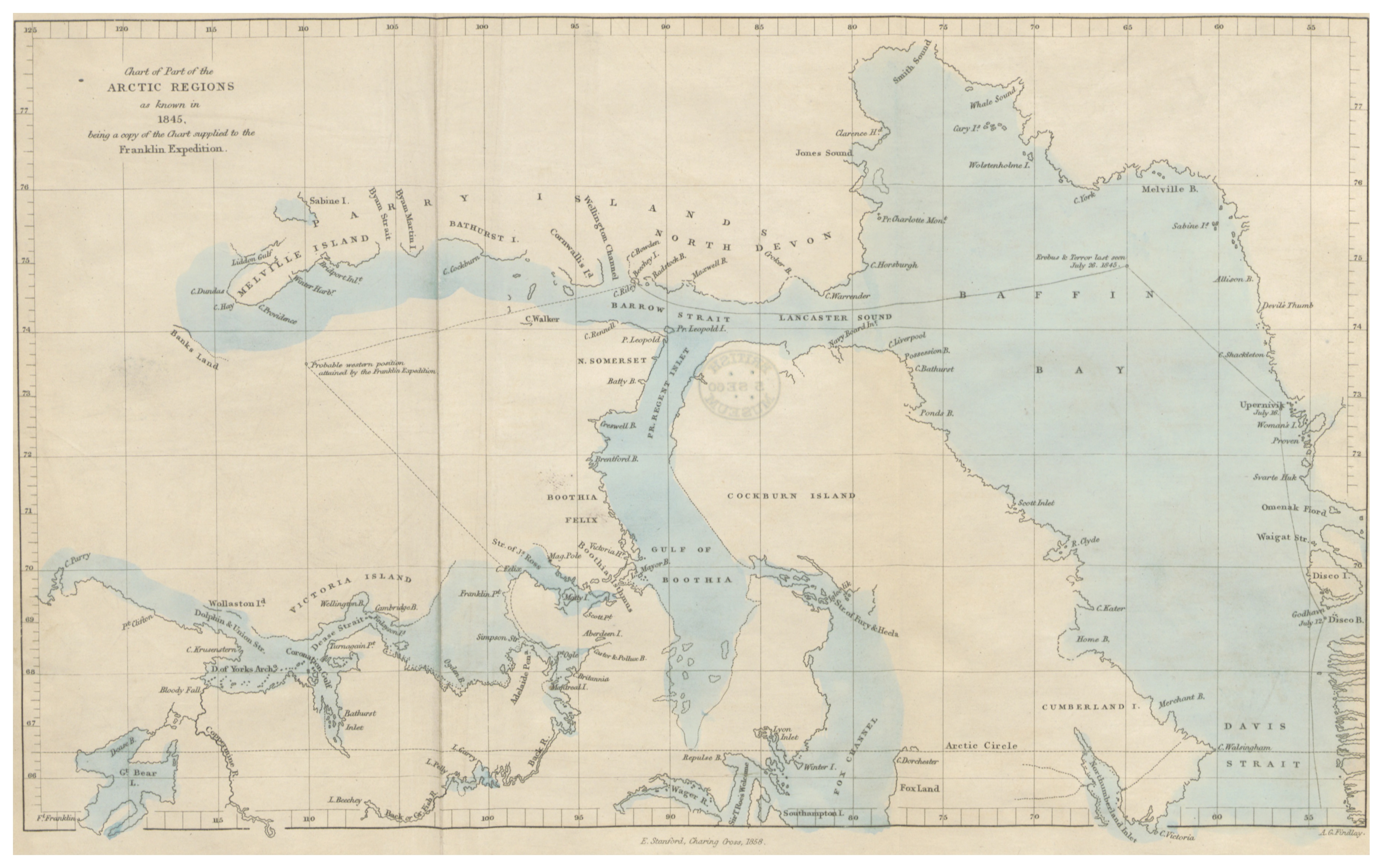
There’s a small qualification in the title of our first map. Not “the Arctic in 1845.” The Arctic as known in 1845. That difference is the beginning of Mapanaut.
A line is a claim.
A coastline looks authoritative. It has a shape, a position, a name. Put it on paper with a measured grid and it begins to feel inevitable. But behind each line lies an observation, a report, an inference, or sometimes a guess.
On this sheet, some coasts are continuous. Others break into dots. Large areas are simply left empty. Those are not unfinished parts of a modern map. They are part of what the historical document tells us.
“Known” also needs a subject. This chart records the geographical knowledge assembled by its makers. A blank on a European expedition chart is not proof that a place was unknown to the people who lived and traveled there.
1845, printed in 1858.
The chart appeared in John Brown’s The North-West Passage, and the Plans for the Search for Sir John Franklin: A Review, published in London in 1858. Its title says it is a copy of the chart supplied to the Franklin expedition.
So there are two moments on one sheet: the geographical picture attributed to 1845, and the later context of the search. The printed routes and notes need to be read with that second date in mind.
A historical map can contain both what people knew then and what someone added afterward.
Digitize the uncertainty, too.
It’s tempting to make an old chart more accurate as we digitize it. Move a coast to its modern position. Complete an island. Resolve a dotted line into a confident border. The result might be easier to use, but it would tell a different story.
Our approach keeps the original geometry in the scan’s own coordinates. We record the line’s category, pattern and meaning. Later additions get their own label. We want the digital version to remain accountable to the document it came from.
The first interactive preview focuses on King William Land. Green linework follows the chart’s coasts. Red linework marks Brown’s later route annotation. A toggle makes the distinction visible without pretending to reconstruct an untouched 1845 original.
A map you can make decisions on.
This same distinction matters in the expedition game. A player who sees a later reconstruction has knowledge their historical counterpart could not have possessed. Hindsight isn’t just another map layer: it changes the decisions available to you.
That is the thread connecting the atlas, the workshop and the simulation. Each asks us to pause between what is there and what we think is there. To read a little more carefully before drawing the next line.
Explore the chartThis note reads the title, publication information and annotations on Brown’s 1858 chart, alongside the digitization records in Historical Map Studio. Full provenance and current limitations.